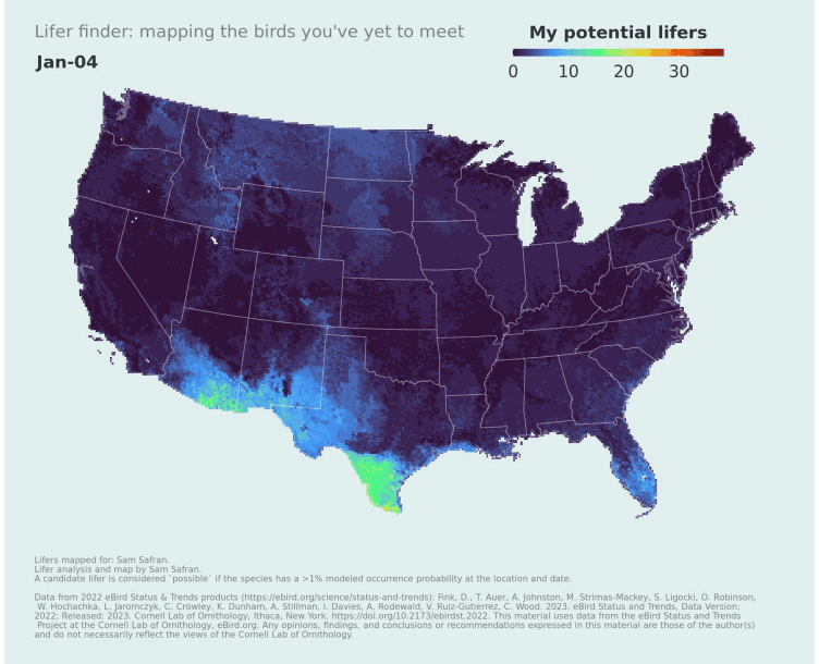
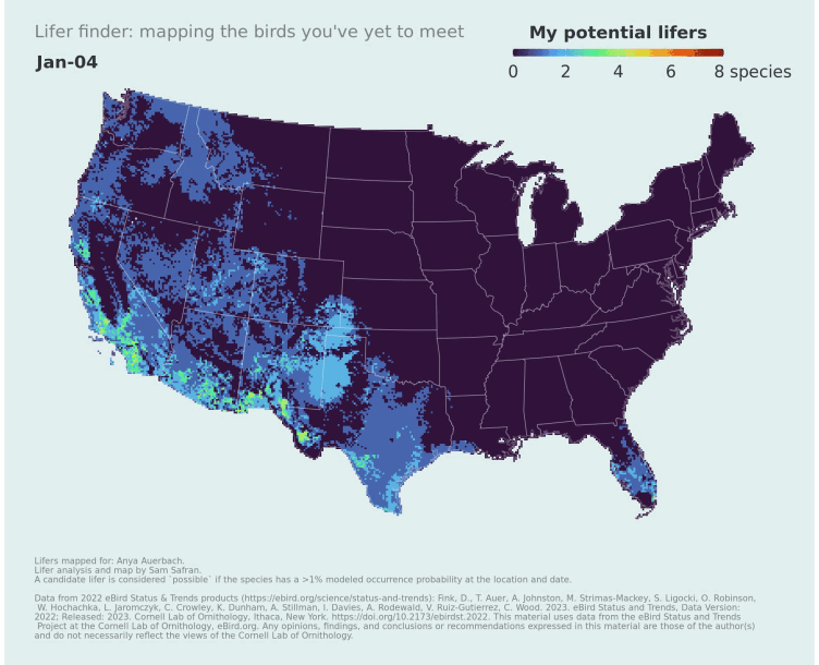
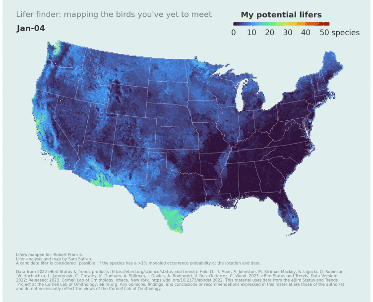
Mapping potential life birds
Published:
eBird Status & Trends products are a collection of datasets describing the distribution and abundance of bird populations. While these products have been put to great use for scientific and conservation purposes, there is also potential to incorporate them into tools designed specifically for recreational birders. Here I leverage Status & Trends data to map the distribution and number of bird species I’ve yet to see–my potential “lifers.” Where should I go if I’d like to see new birds? When should I go there? These are familiar questions to birders, and I wanted to approach answering them in a rigorous and visually-appealing way.
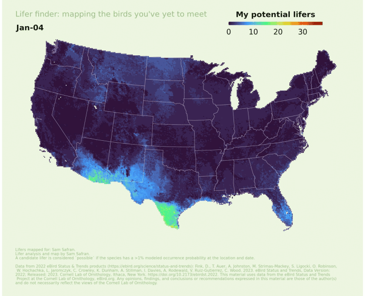
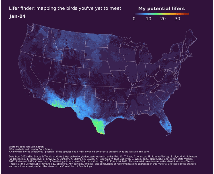
First, I used my personal eBird data download and the rebird package to compile a list of all bird species in the US that I haven’t encountered and downloaded the occurrence layers for these species with ebirdst. With terra I stacked the occurrence layers and counted the number of species with occurrence probabilities greater than 5% in each grid cell and week. The resulting layers provide weekly estimates of my potential lifers at each location/date. I used the tidyterra package to plot the individual rasters and the magick package to stitch them together, giving me an animated summary of the birds I’ve yet to see.
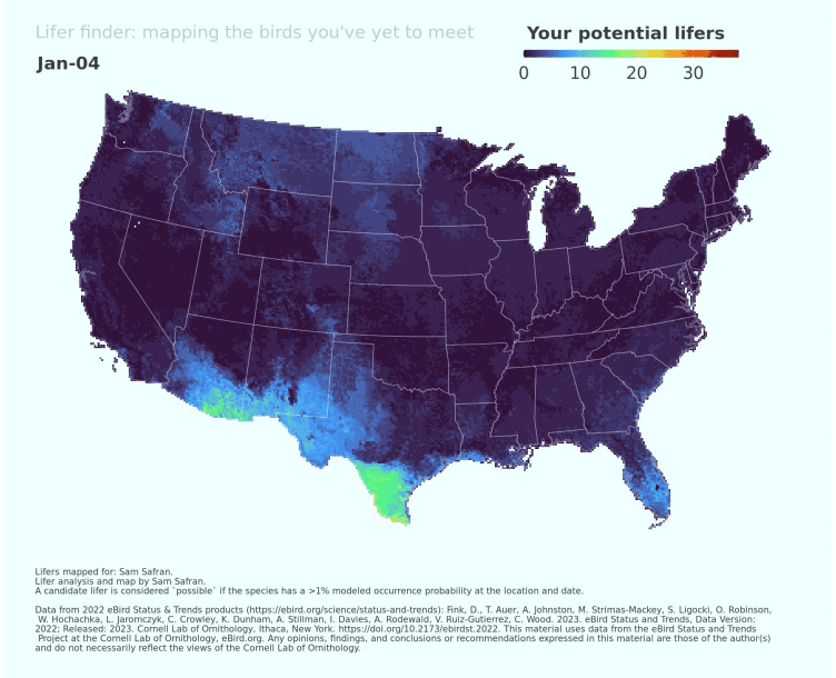
Looking at my map it’s clear I need to get to SE Arizona, where there are up to 34 potential lifers in a single 27x27 km grid cell (on August 9th)! South Texas is not far behind. It is fun to see the Dakotas light up during the breeding season (I’m missing some prairie specialists including Baird’s Sparrow and Sprague’s Pipit). The Southeastern plains and pine woodlands warrant attention (Brown-headed Nuthatch, Bachman’s Sparrow, Red-cockaded Woodpecker). South Florida too (Florida Scrub Jay, Snail Kite, Short-tailed Hawk, Mottled Duck, etc.).
Each person’s map will have their fingerprint, reflecting where they’ve spent time birding and what species they’ve seen. Here are some I’ve made for others.
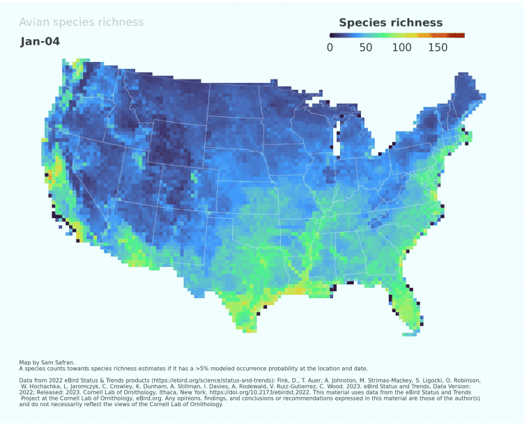
There are many potential variations of these maps. I experimented with a version that simply sums the occurrence probabilities of all species, giving something like an “expected” count of lifers at a given location and date, but this is harder to interpret since the occurrence probabilities estimate the expected likelihood of encountering a species on a 2 km and 1 hour long travelling checklist under optimal conditions, which differ from species to species (and it’s not as though birders are limited to a single checklist/outing when visiting a new location). Thus, I opted for the simpler approach–summing the total number of species with a reasonable chance of being encountered. In the future I’d also like to explore weighting the probabilities based on the species range (e.g., a location with 5 potential lifers that range across the whole continent wouldn’t have the same visual weight as a location with 5 potential lifers highly localized to that area). Finally, by providing an “empty” life list, the code can also generate a dynamic annual map estimating total species richness.
R code to generate lifer maps for yourself is available in the lifeR GitHub repository. I’ve designed the code to also work for any individual US state and it can be easily adapted for other geographies, though runs in other countries would currently be limited by the number of species with available Status & Trends products. There’s also functionality to switch from your global needs list to a regional one (i.e, mapping the birds you haven’t seen in a particular country or state). Fair warning: these analyses require a machine with substantial working memory. I can run individual states on my laptop, but for the entire US I need to offload the workflow to an HPC system with dozens of gigs of RAM. Fortunately, thanks to ebirdst and terra, the actual processing time is remarkably fast once there.
No promises, but if you’d like a map for yourself and don’t have the capabilities to run the code please reach out. I’d just need your personal eBird data download file.
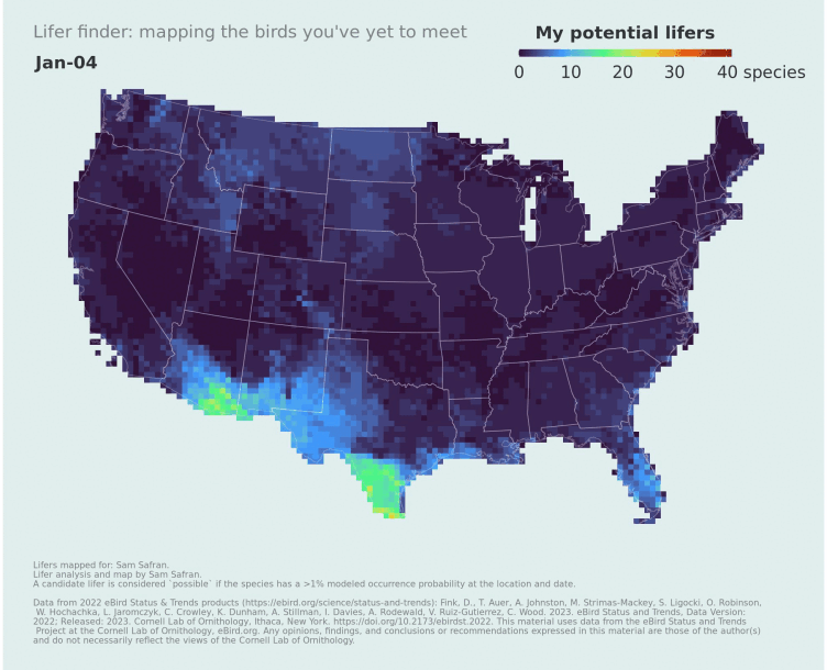
Update 2024-01-17: I added support for the higher-resolution products. I think the 9x9 km map is more informative than the 27x27 km map:
Update 2024-01-26: Added a parameter to toggle the theme: light blue, light green, or dark mode! Dark mode uses the lowest value on the color ramp as the background, which I think is very evocative (with the possible downside of incorrectly implying there are zero potential lifers outside of the mapped boundary).